The “Information is Beautiful” Awards and Philosophy
The Kantar Information is Beautiful Awards aim to recognize “excellence and beauty in data visualizations, infographics, interactives & information art” in various categories.
No explicitly philosophical entries were among this year’s winners, which have been announced over the past week. However, an interesting interactive visualization of the I Ching, by Peiyuan Tang and Han-wei Shen, did make the longlist. There’s a still image from it at the end of this post, and you can play around with the interactive version here.
Looking over the entrants from the past few years, there have not been very many in philosophy. I’ve posted about some of them (the Evolution of Kant’s Lexicon, the Structure of Philosophy, and a History of Philosophy Timeline), and there have been other visualizations I’ve noted (for example, a Visualization of Influence in the History of Philosophy, a couple of projects on Spinoza’s Ethics, a subway map version of Wittgenstein’s Tractatus, and Six Degrees of Francis Bacon, to name a few).
I’m putting up this post, first, as an excuse to ask for more examples of philosophy visualizations, so if you know of any recent ones I may have missed, either post them in the comments or email them to me. But second, I’m posting it to encourage philosophers to be thoughtful and creative with the presentation of their ideas (I haven’t yet picked up this book but I would bet it is very helpful, and there is always this classic), and maybe consider submitting to the Information is Beautiful awards. The next deadline will be in June, 2019.

Still image from an interactive visualization of the I Ching, designed by Peiyuan Tang and Han-wei Shen

in the defense of people who do this, it’s a lot harder to make visualizations of philosophy than it is other disciplines; you can infodump the empirical fields, but to make legitimately interesting philosophical graphics you have to understand the ideas.
I’ve also found that philosophy (at least in the forms I am familiar with) tends to encourage symbolic and linguistic thinking rather than visual thinking. When there are mathematical results that are of relevance to philosophy, I often find that mathematicians react best to an easily visualizable proof, while philosophers react best to a proof where the syntactic form makes clear what is going on. Philosophers very rarely use diagrams in our writing.
@Alfred: it’s the same for other disciplines, doing visualizations/infographics well is never easy.
It is a very rare philosophical visualization that is worth a thousand words.
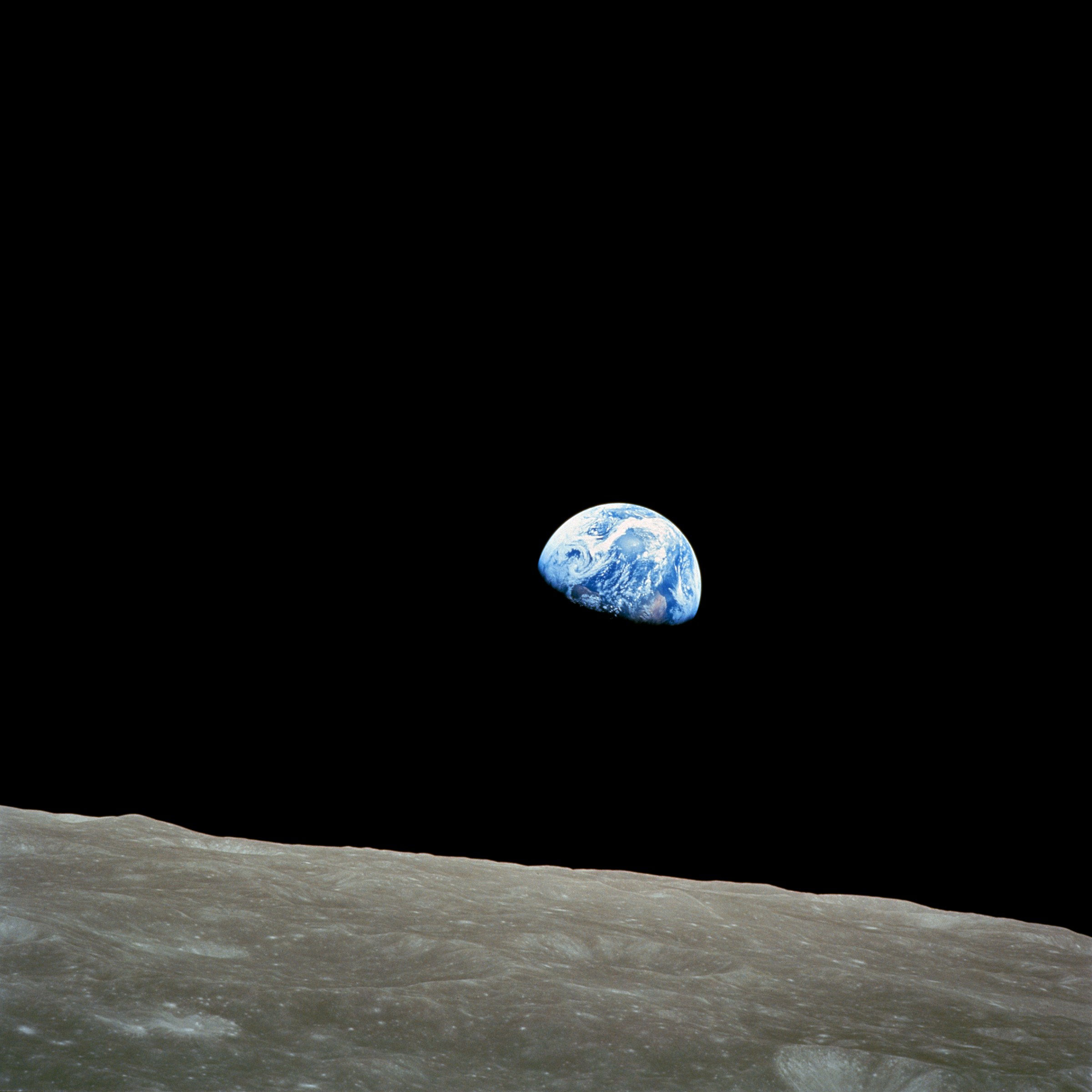
Yet, on December 24, 1968, fifty years ago this Christmas Eve, a most powerful image made philosophers, or at least beginning wonderers, of hundreds of millions: