
New Visualization-Based Interface for the Stanford Encyclopedia of Philosophy
Data engineer and developer Joseph DiCastro has created a visualization of the Stanford Encyclopedia of Philosophy (SEP) through which users can search for entries and see the connections between them. It generates attractive visualizations, but is also a well-designed, useful, and approachable tool for navigating the SEP.
“Visualizing SEP” provides clear visualizations based on a philosophical taxonomy that DiCastro adapted from the one developed by the Indiana University Philosophy Ontology Project (InPhO).
Type a term into the search box and suggested SEP entries will be listed. Click on one of the entry titles, and a simple visualization will appear with your selected entry at the center and related entries surrounding it. A brief summary of the SEP entry appears on one side of the screen, with a link to the full article, as well as a notation of the entry’s “primary domain,” (usually a philosophical subfield). On the other side is a list of the primary domains of the related entries. The domains and their corresponding entries are color-coded, too. If you’d like, you can flick a switch and the related entries appear as a list. You can also see the tallies of incoming, outgoing, and bidirectional links between the selected entry and others, and mouse over those indicators to highlight the corresponding linked entries.
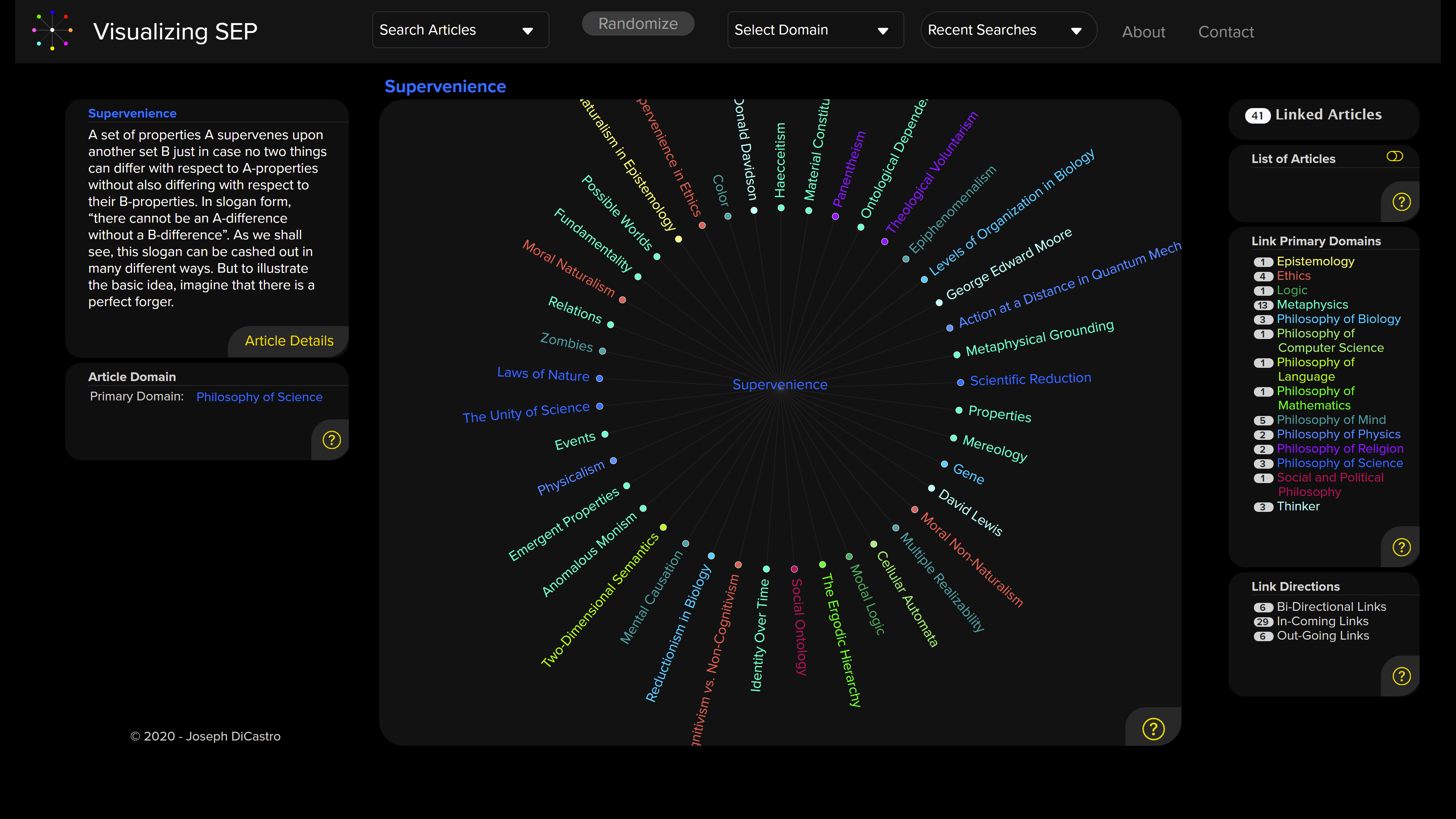
Here’s what you see when you search for and click on “supervenience”:
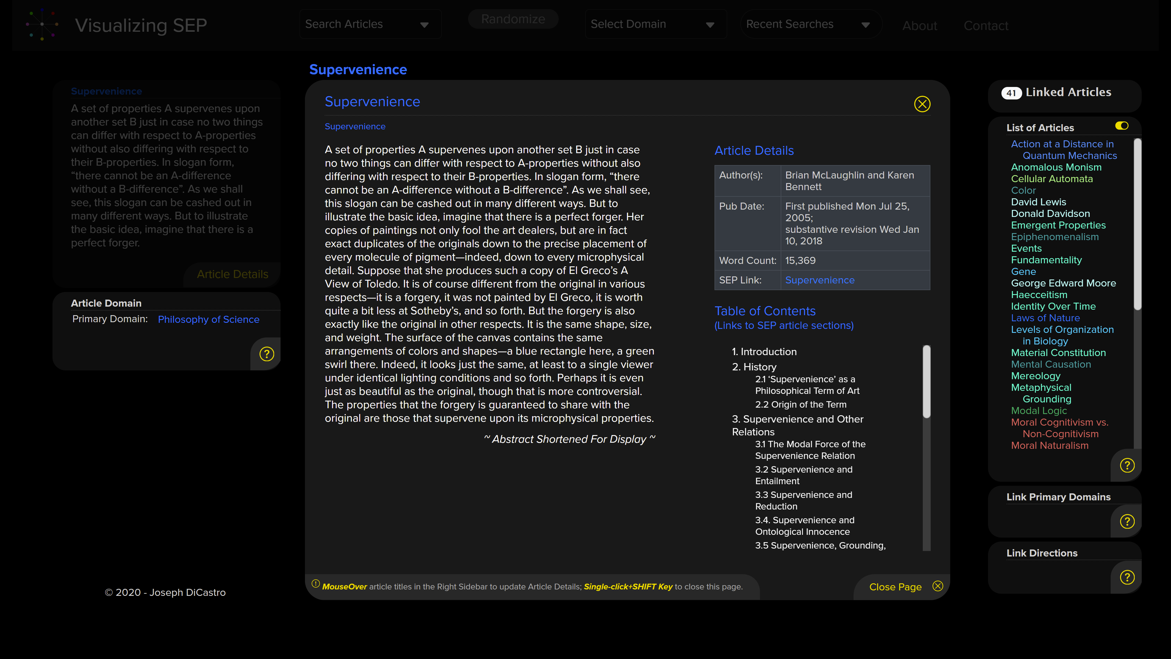
You can click on “article details” and get more of a preview of the SEP article with links to its various parts, like so:
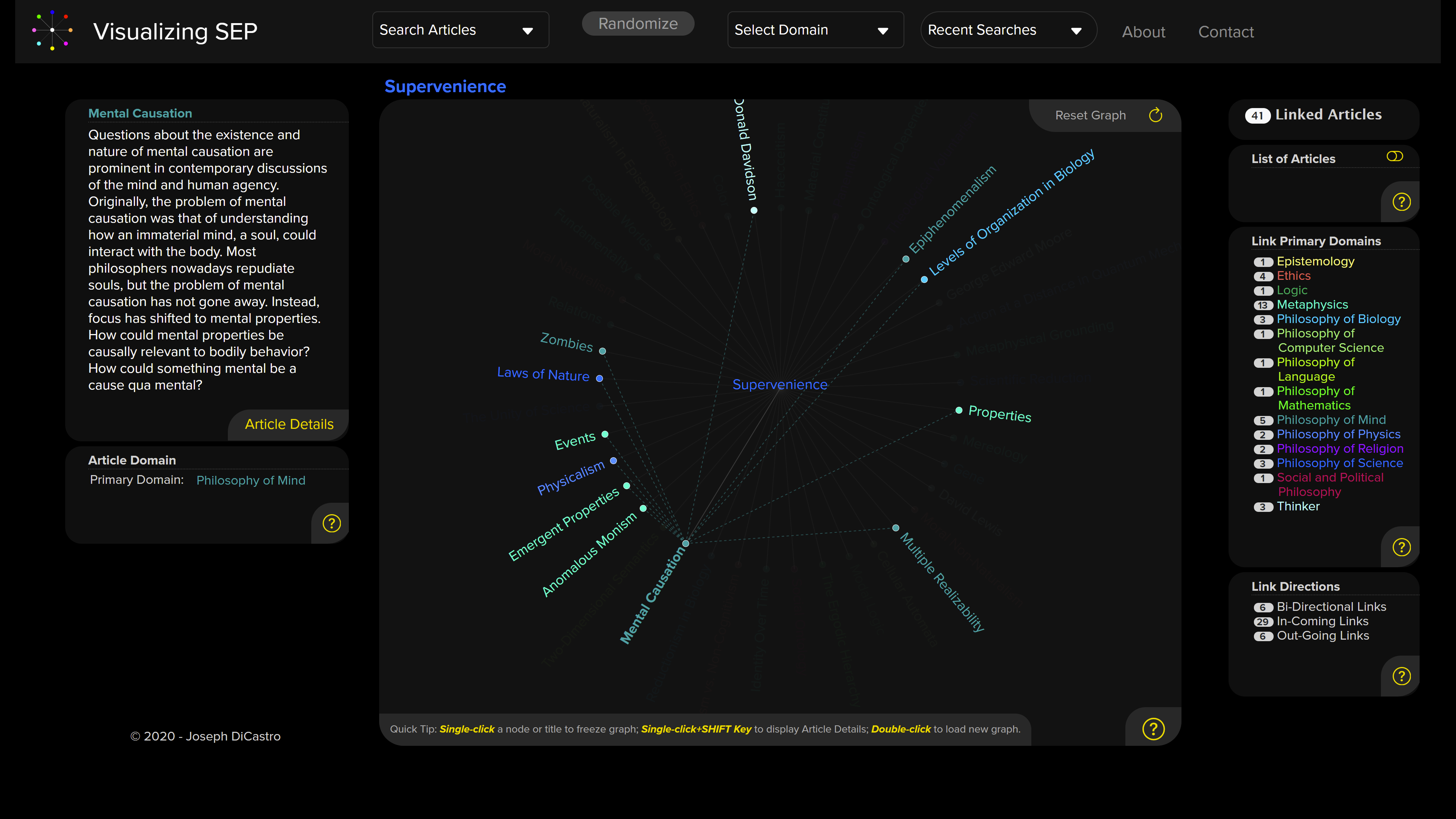
Or you can mouse over the various related or linked entries on the visualization to see their connections to each other. Here I pause the mouse over “mental causation”:
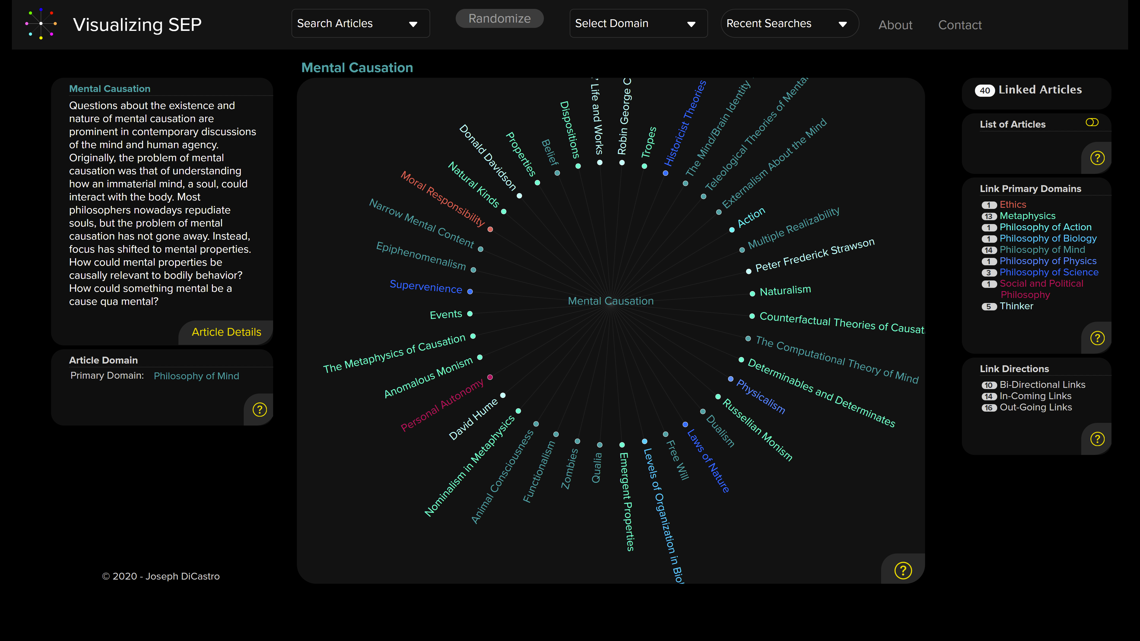
If you click on a related entry, you’re taken to a new visualization with it at the center, as I do with “mental causation” here:
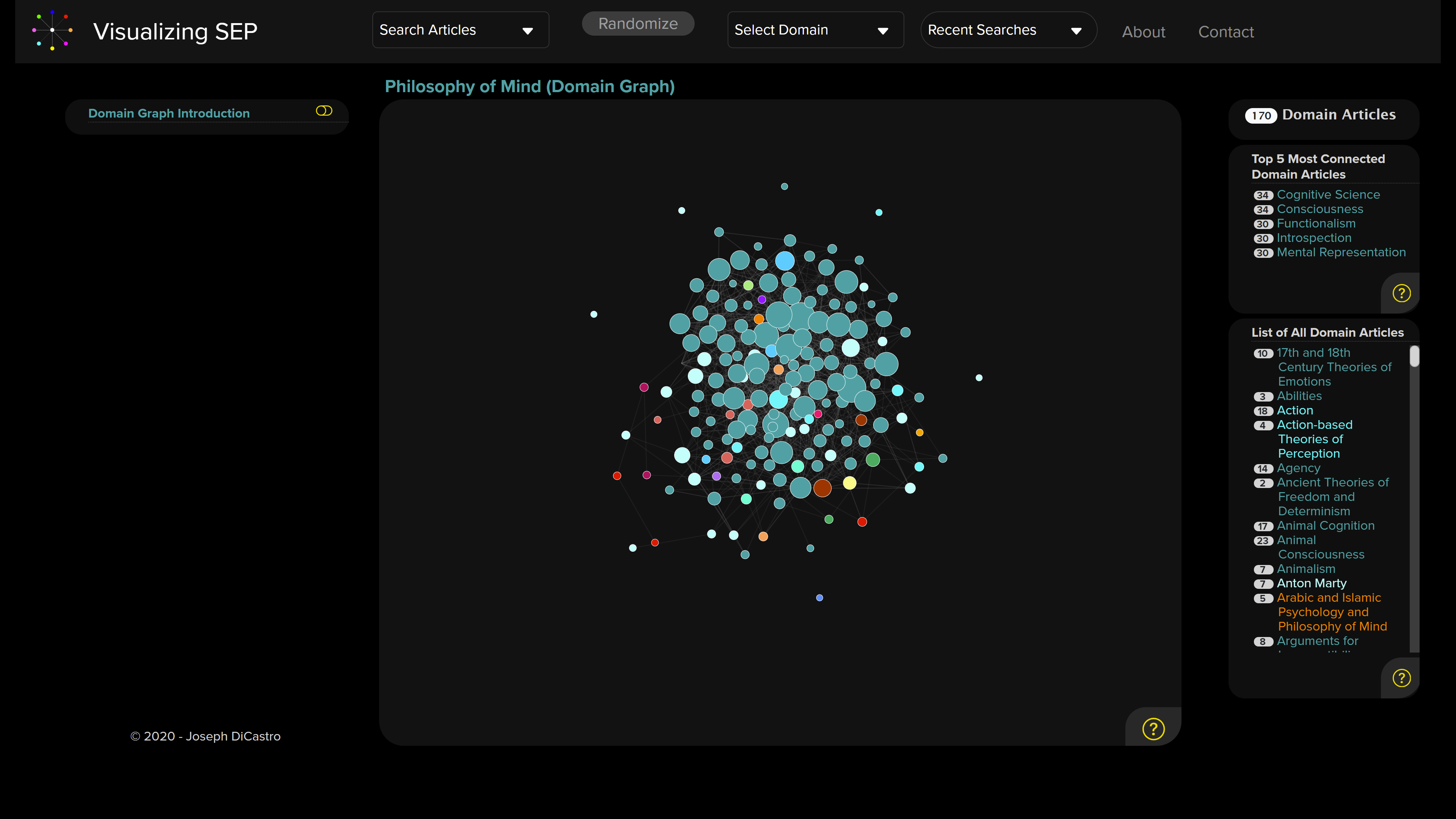
If you single-click on a domain name, you get a “domain graph,” or map of that domain, a list of the 5 most “connected” articles in that domain, and a longer list of all the domain’s articles. The nodes on the map represent individual articles in the domain. DiCastro explains:
the Domain Graph shows how articles in one domain are all linked together: articles that are central to the domain will be clustered together, and share many links between them; while articles at the periphery of a domain will be offset from the central network, and may even stand alone if they do not link to other articles in the domain. Nodes are sized according the number of links in the domain: the larger the circle, the greater number of links that node is related to.
The nodes are also color-coded in accordance with their primary domain.
Here’s what appears when you click on the “philosophy of mind” domain link:
This takes a bit of exploring. As you mouse over those nodes, you reveal the names of the articles they represent, a preview of the article, and linked articles. Here, I mouse over “intentionality”:
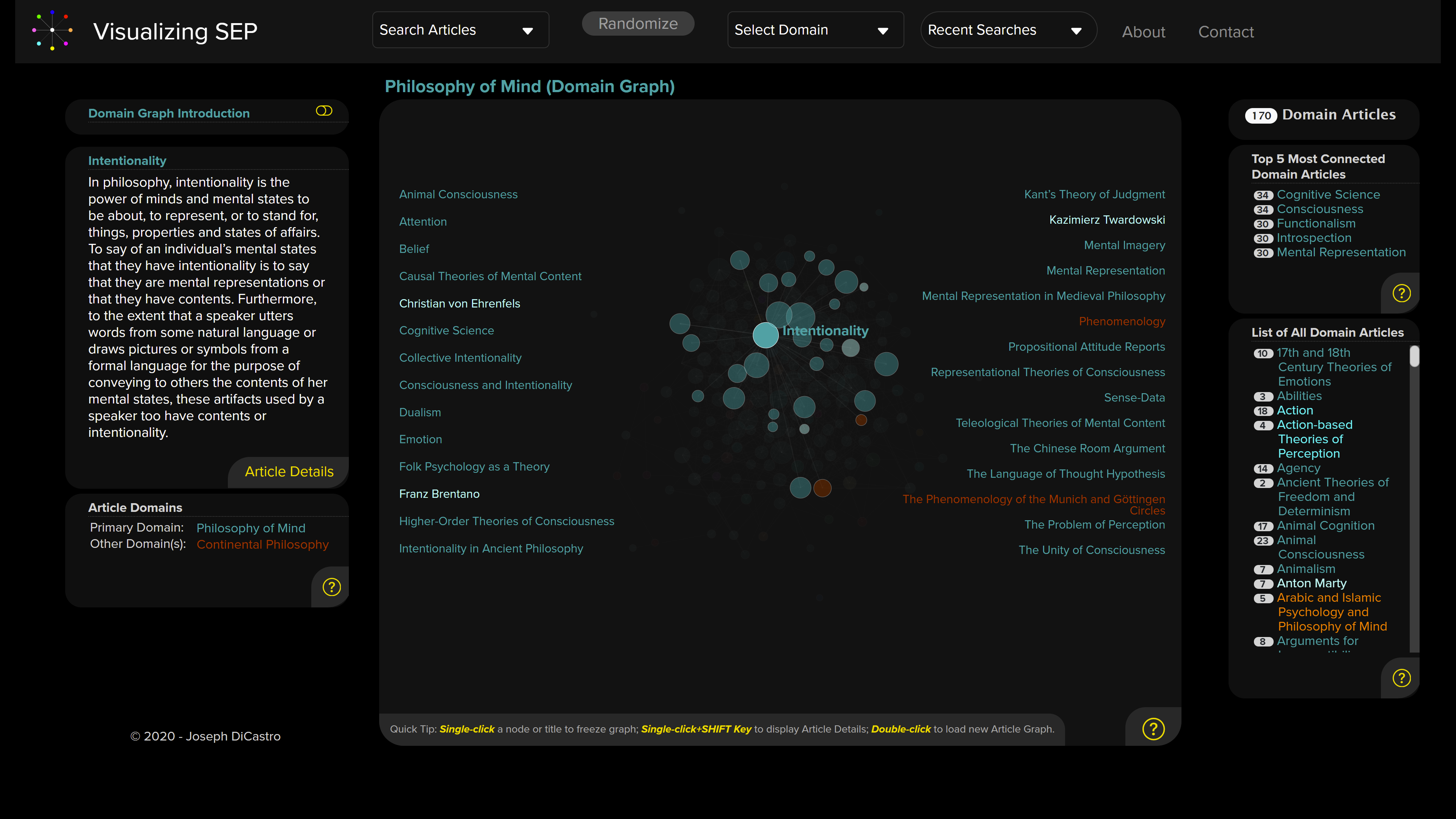
Clicking on “intentionality” will freeze the map on it and allow you to explore the linked articles, offering an alternative way to browse through the SEP. Double-clicking on the linked articles takes you to their visualizations, and your exploration can continue.
I found Visualizing SEP pretty easy to use, and DiCastro populates each page with plenty of explainers to click on should you want to know how something works (look for the encircled question marks).
I can see some people bookmarking it to use as their regular entry point into the SEP. Check it out here.
(via Hannah Haejin Kim)
Related:
- “The Structure of the Stanford Encyclopedia of Philosophy Over Time, Visualized“
- “A New Map of the Stanford Encyclopedia of Philosophy“
- “New Map of SEP Based on Reciprocated Entries“
- “Visualizing the Connections among Philosophical Topics“
- “How the SEP Works, and Why It’s a Model for the Internet“
- “Interactive Visualization of Philosophy on Wikipedia“
- “A Map of Philosophical Ideas, Works, and Figures“
More posts about philosophy-related visualizations are listed here.


Thanks to Joseph for putting so much work in!