
New Interface for Academic Philosophy Data & Analysis (guest post)
Academic Philosophy & Data Analysis (APDA), an ongoing project to collect, analyze, and distribute data about job placement, student experience, and other aspects of PhD programs in philosophy, is launching a new “data dashboard” through which people can explore the information it has collected.
In the following guest post, project director Carolyn Dicey Jennings (UC Merced) walks us through it.
(A version of this post originally appeared at the APDA blog.)

The New Academic Philosophy Data & Analysis Dashboard
by Carolyn Dicey Jennings
Between February and August of this year the APDA project has been busy collecting and checking data on the employment status of recent graduates from nearly 150 philosophy PhD programs.
Three people were especially key to this effort: Alisha Nesslage, now a graduate student at UC Irvine, Ricardo Rodriguez, a computer science major at UC Merced, and Aarynn DeLeon, a philosophy major at UC Merced. In parallel to these efforts we rolled out a new survey, with the help of Neelum Maqsood; we hope to release a research report with the full results of that survey in the coming months.
To help capture these efforts, we now have a new data dashboard which will soon launch to the homepage:
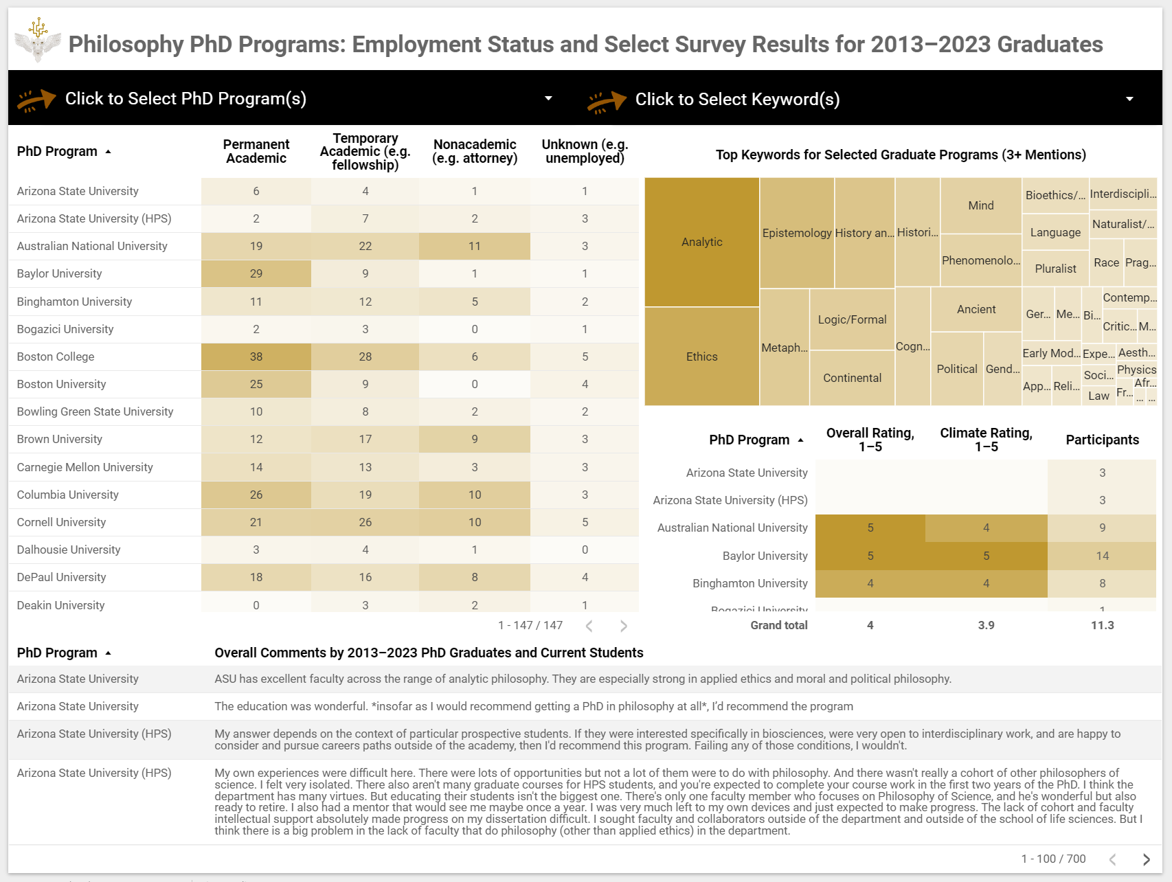
Image of the new data dashboard for APDA website
Let me walk you through some key features of the dashboard. First, the dashboard has four panels:
- employment data for 2013–2023 graduates from 147 programs,
- keywords chosen by at least 3 survey participants from those programs (survey participants include current students and 2013–2023 graduates)
- average program ratings by survey participants (if 5+ participants)
- comments by survey participants
It also has two filters:
- a PhD program filter, which can be used to examine a subset of PhD programs
- a keywords filter, which can be used to examine select keywords
For example, if one wanted to look at the University of California system as a whole, one could select all the UCs with the filter dropdown:
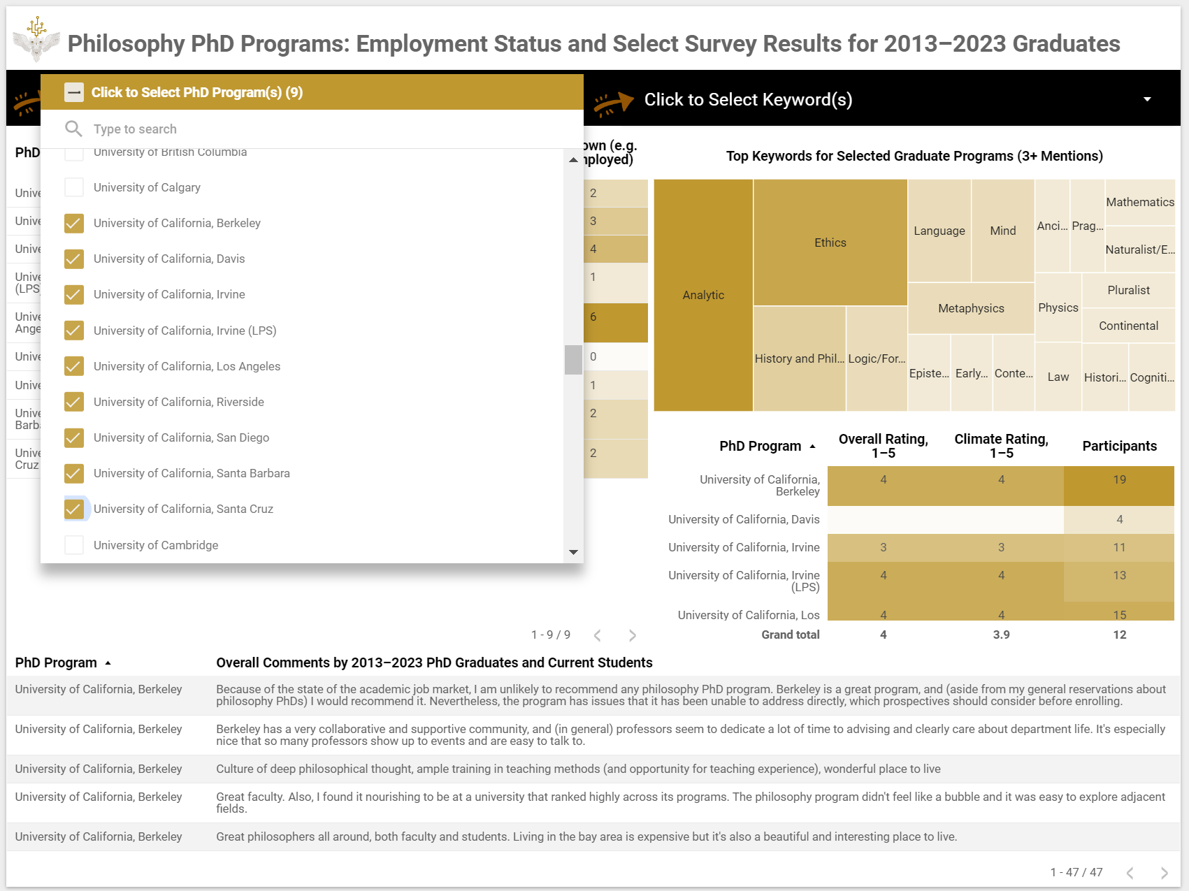
An image of the new data dashboard with the University of California campuses selected
Further, one can re-sort the tables to more easily see differences between programs (this view has been sorted by permanent academic employment and overall rating):
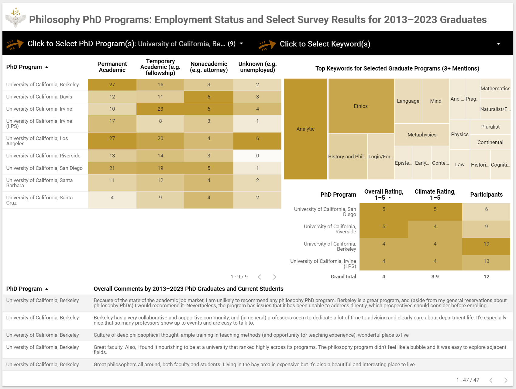
An image of the new data dashboard with the UCs selected and the tables re-sorted
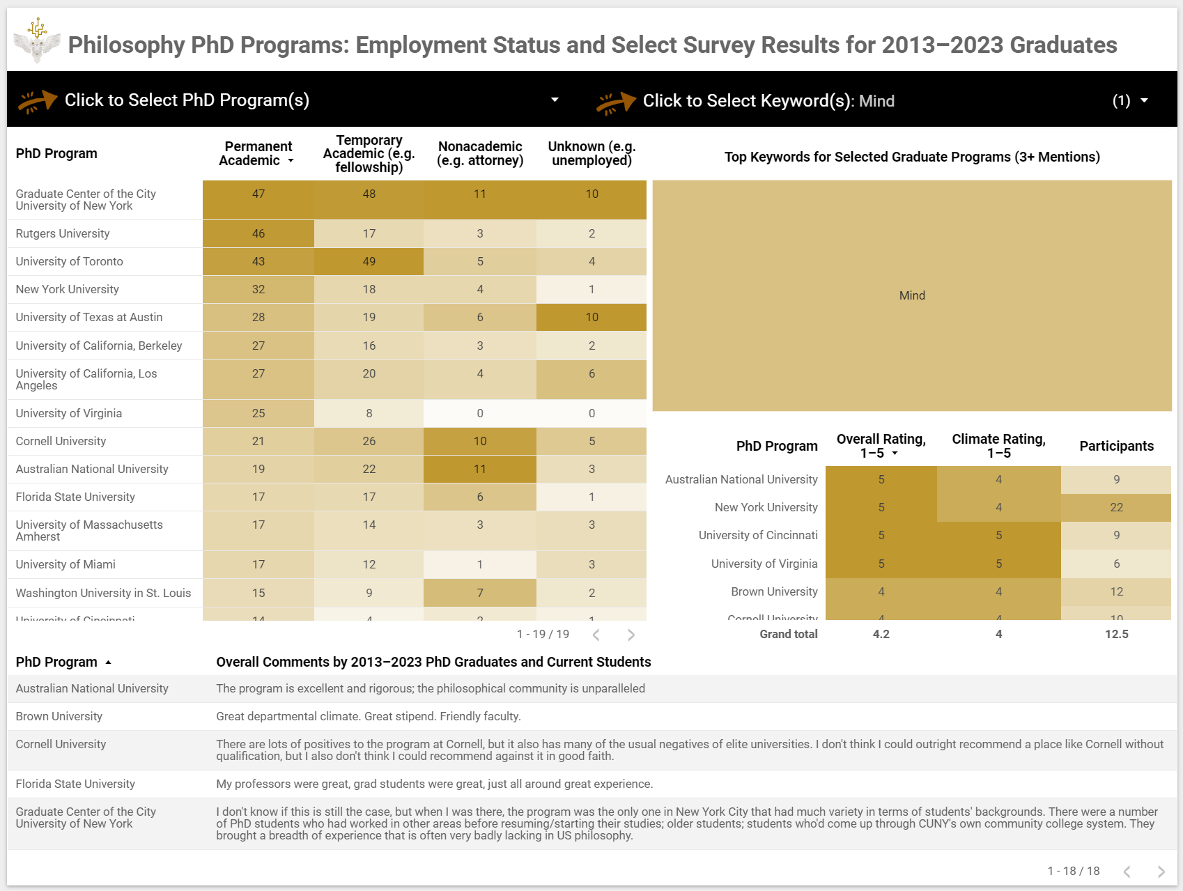
In contrast, if one wanted to look at philosophy of mind, one could select from the keyword filter:
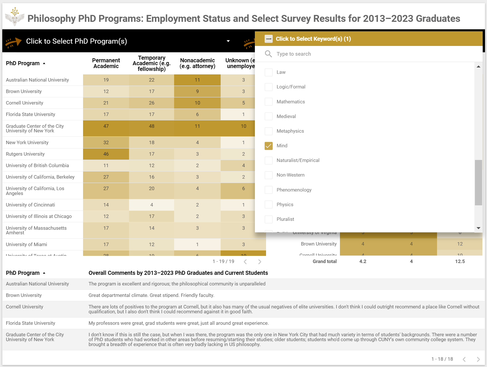
An image of the new data dashboard with “mind” selected
As with the program filter, one can then re-sort tables as needed. (Note: the comment panel doesn’t align well with the keyword filter, and will only show some of the comments (randomly) when that filter is activated):
An image of the new data dashboard with “mind” selected and resorted by “permanent academic placement”
You can try out the dashboard yourself here. Let us know if you have any questions or comments about it. And stay tuned for blog posts on this year’s findings.