
The Structure of the Stanford Encyclopedia of Philosophy Over Time, Visualized
Created in 1995, the Stanford Encyclopedia of Philosophy (SEP) has grown to become not just an expansive and trusted collection of expertly-written entries on philosophical subjects, but a model for improving the internet. Now Adam Edwards, a Ph.D. student in philosophy at the University of Illinois at Urbana-Champaign, has created an interactive visualization of the SEP and its growth over time.
Here’s how he explains his project, which he noted in an email is “very much a work in progress”:
The [SEP] is a “dynamic reference work” that has a significant influence in and on academic philosophy. The SEP is also an enormous resource of data about academic philosophy. This project is an attempt to represent the network structure of the SEP, visualize its global properties, and understand the structure of academic philosophy as represented in the SEP.
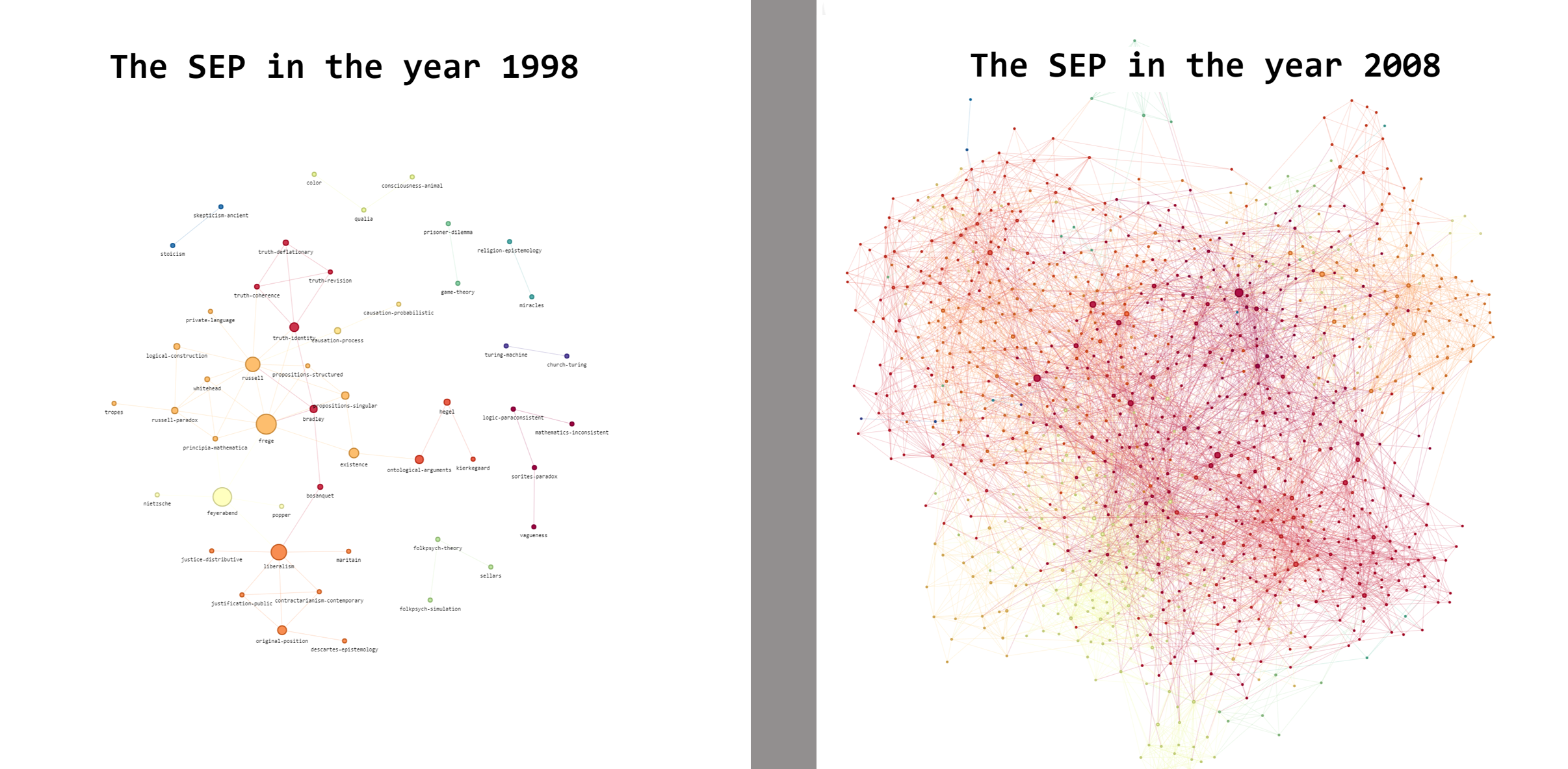
His visualizations are made possible by the fact that the SEP has been archived four times a year since 1997. In them, the nodes represent individual entries and are sized by their “centrality” and color coded by broad philosophical area.
Screenshots of the SEP in 1998 and 2008 make apparent its remarkable growth.
You can read a description of the project here and explore the graphs from 1998 through 2008 yourself here. Below is a brief video I made exploring the 2008 version.
Is Edwards going to make similar visualizations for more recent years? I’d like to see just how much bigger and more complex 2018 is compared to 2008.
Hi Curioser,
I am planning to make visualizations for more recent years, but the size and density of the graph at that point makes reading anything useful off of it almost impossible (although I agree that it would be interesting just as a comparison). I’m still figuring out how to display the info in an intelligible way.
For more recent graphs, [this link](https://adamdedwards.github.io/sep-graph/) has the 2018 SEP divided up into 11 “communities.” This makes the whole network a little easier to navigate, and you can see the “influential” nodes for each subarea of philosophy more easily.
I’ve tried to solve the graph-density problem by using a umap-embedding (and dropping links in the visualization): https://homepage.univie.ac.at/noichlm94/posts/structuring-the-stanford-encyclopedia-of-philosophy/
I really like how you capture the temporal aspects. It might be interesting to combine the approaches and produce an embedding of the evolution of the SEP. If you would like, we could cooperate on such a project. 🙂
Cheers, Max
Curiouser,
This isn’t quite 2018, but back in 2017 my group did a similar analysis. You can see one of the pictures of it here: https://sites.google.com/site/aahiggi/home/pictures-of-philosophy
Hi everybody,
I’ve also made an interactive map of the Stanford Encyclopedia. You can find it here: https://homepage.univie.ac.at/noichlm94/posts/structuring-the-stanford-encyclopedia-of-philosophy/ (Best to look at on a screen larger than a phone.) It’s from late 2018, so most articles should be in there.