
What Philosophy Journal Decisions Look Like
Sometimes a picture is worth a million words, or at least a number of numbers. Writer Natasha M. Frost has created a visual representation of publication decisions made at a number of academic philosophy journals, as reported by authors at the Blog of the APA’s new journal survey site:

No wait, that is not it.
Here you go:
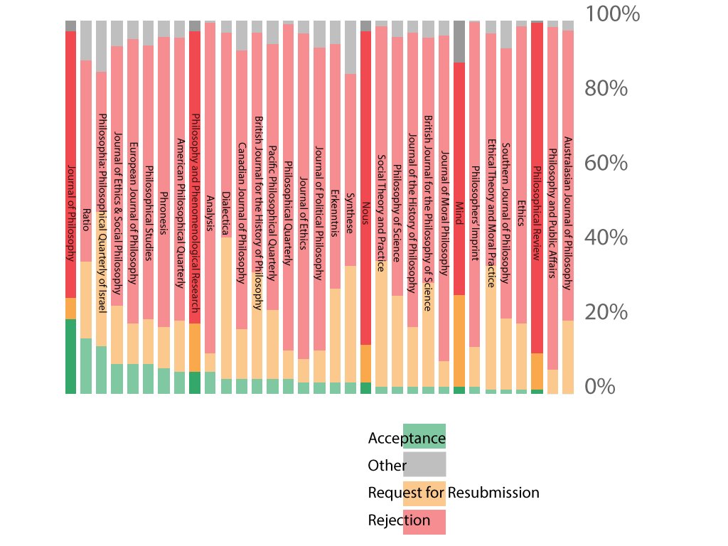
The green—yes there is green on the graph, though you might have missed it if you just took a quick glance–represents the acceptances.

I am deeply sceptical that 20% of submissions to J Phil are accepted.
Agree. It’s just that those who do get accepted are so happy that they rush right over to the journal survey site to tell everyone about it.
I wish Philosophical Review authors had the same dispositions.
(Your comment prompted me to just now move the reference to the source of the data to earlier in the post. Thanks.)
Green represents *initial* acceptance rate. That is, papers that get accepted *without* a revise and resubmit. No wonder why The Journal of Philosophy has 20% and the Australasian Journal of Philosophy has 0%. This should be clarified in the graph/text.
A 20% initial acceptance rate at a journal of JOP’s standing seems very surprising given their claim that submissions are subject to double-blind review. Or am I missing something here?
I agree it is highly surprising. The graph is quite misleading: green are initial acceptances and yellow really indicates R&Rs that we’re accepted, so acceptance rate according to the data is the sum of green and yellow in the graph. TBH I doubt these data are indicative of anything. Not only they are self-reported, which introduces all sort of biases, we are presented only with means, without any indication of the variability of the data. Even worse perhaps, we don’t have any indication of the data collection range. That is, are these data for one year, two, ten? Phil Studies has the highest number of surveys: 511. If that’s for one year it is very impressive, if it’s for 5 years, it’s probably just a small sample at best. And the number drop really quickly to below 100 surveys. Ratio, for instance, has only 59. But Cullison started collecting these surveys years ago, which makes must numbers hardly representative. So, even bracketing the issues about self-reporting, there is no direct way of knowing how reliable these data are. In my opinion, this database is highly misleading and we might be better off reading tea leaves.
Is there any way to figure out what would be relevant to a determination of whether or not these figures justly represent (with appropriate margin of error) the portion of relevant scholarship these journals can reasonably issue? What would it mean to say this graph can be seen as a sign of (socioeconomic) bottlenecking the proliferation of knowledge? How easy is it for a group of academics to start a journal?
What could the “other” category include? Interesting.
The other options on the survey are “Conditional Acceptance,” “Withdraw,” and “Initial Verdict.”
This graph is extremely difficult to read for some people with colorblindness. Are there any alternative color schemes available?
You know there is a problem in the field when, first, these data are available only from self-reports rather than journals making them available. Second, assuming the data are somewhat accurate, you know there is something going on when it is almost an order of magnitud harder to get a paper in the Australasian Journal of Philosophy (a fine journal) than in Nature (whose acceptance rate is ~8%).